Case study — Astro · Editorial
Mª Eugenia & Christian
About the project
This time the client was a little special: my own wedding. We wanted a digital invitation to replace paper, reach guests far away with no friction, and gather all the info and guest management in one place.
Animated envelope opening
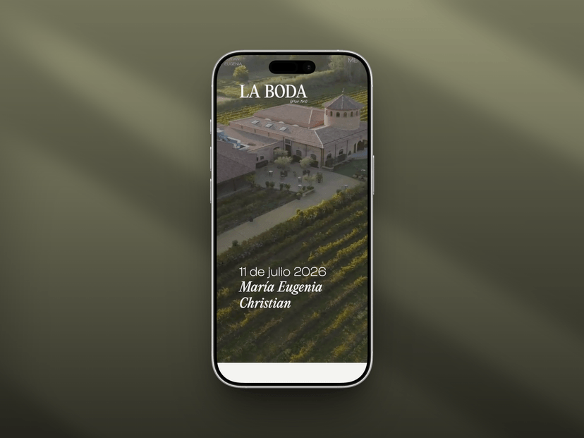
The site opens like a physical invitation: an animated envelope unfolds on click, revealing a drone video of the venue that sets the tone from the first second.
Guest confirmation & management
A single form centralizes much more than the confirmation itself: menu, intolerances, kids’ menu, how they’ll arrive and whether they need the bus. Every submission is logged and notifies the couple instantly.
Gallery & storytelling
The gallery unfolds as an editorial walk, not an aggressive carousel, with soft transitions that keep scrolling light.
Clear logistics
All the practical info at a glance: date, schedule, transport, venue and contact, answering doubts in seconds.
Technology & security
Built with Astro, Astro Actions and TypeScript, styled with SCSS. Form submissions use Resend and data is stored in Supabase. Cloudflare protects submissions from bots and logs submission attempts, while a dedicated admin login page allows reviewing the guest list.
Results
Zero paper, instant delivery anywhere and all guest management centralized. A site that, in the end, was all about us.
mariuychris.es — opens in new tab